AnnaDaan Design System
Mobile Design System
Building the AnnaDaan Design System

Project Overview
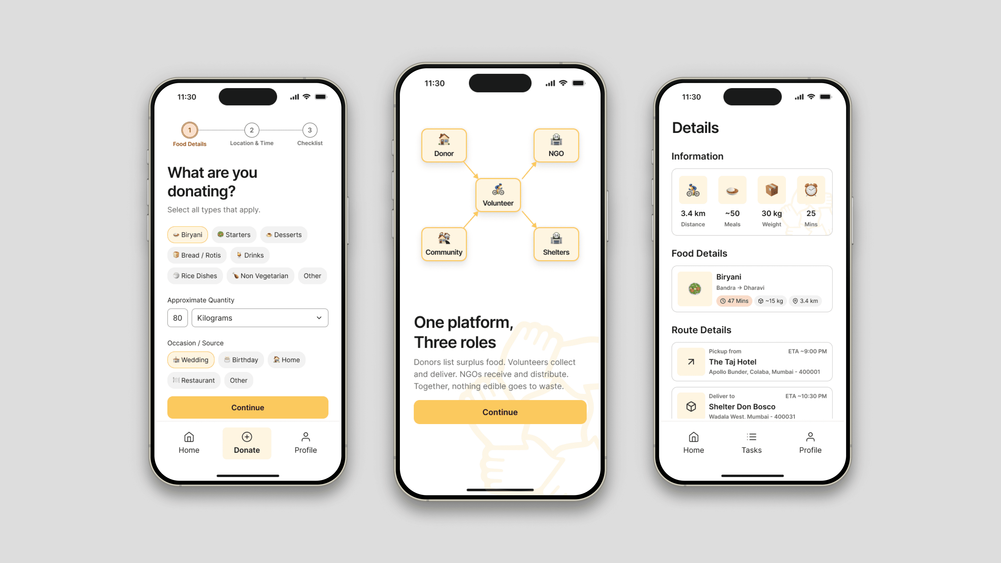
AnnaDaan is a mobile platform designed to reduce urban food waste in India by connecting food donors, NGOs, and volunteers in real time.
To solve this, I created a design system that served as a single source of truth for the entire product, enabling faster design decisions, a more consistent experience, and support for both light and dark modes.
Deliverable
Mobile design system built in Figma
Timeline & My Role
2 Months. Solo designer
Project
For the full product story, see the AnnaDaan case study.
The Problem
Unlike traditional applications, AnnaDaan was designed for three distinct user groups

Food Donors
Volunteers
NGOs
Each group had different goals, responsibilities, and workflows, yet all belonged to the same ecosystem. As screens increased, I found myself repeatedly creating similar components, making visual decisions multiple times, and manually maintaining consistency across flows. Rather than designing screen-by-screen, I needed a system that could scale with the product.
The Goals
Before creating the system, I defined four goals that would guide every design decision.
Consistency Across Three User Modes
Although Donors, NGOs, and Volunteers perform different tasks, the experience should feel like one cohesive product.
Faster Design Decisions
As the sole designer working on the project while balancing academics and internship, I needed a framework that reduced repetitive work and allowed me to iterate quickly.
Clean & Predictable UX
Users shouldn't have to relearn patterns when navigating between different parts of the platform.
Accessibility for Indian Users
AnnaDaan was designed for a diverse audience with varying levels of digital literacy.
Process
Following the Atomic Design methodology
I built the design system using Atomic Design principles while incorporating workflows commonly used in industry-scale systems. Rather than starting with components, I first focused on creating strong foundations.




Sub-Atomic Particles
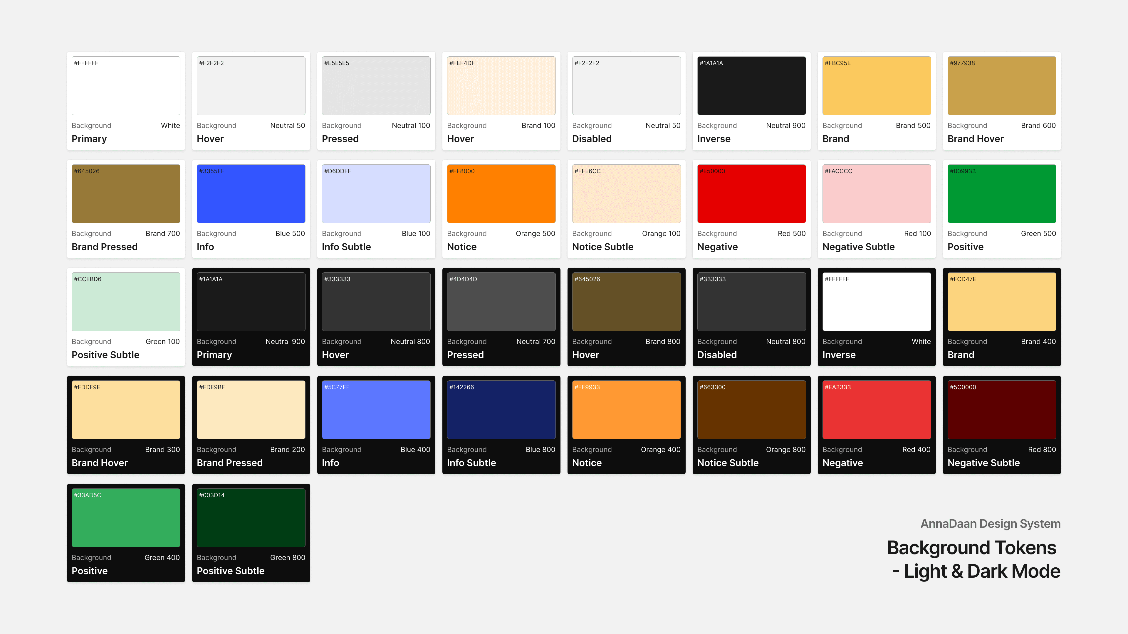
The smallest building blocks of the design system. Sub-atomic particles establish the visual language of AnnaDaan through reusable design tokens and foundational rules that ensure consistency, scalability, and accessibility across the product.

Atoms
Atoms are the fundamental UI components that form the basis of every interaction. They represent single-purpose elements designed to be reusable, accessible, and consistent throughout the platform.

Molecules
Molecules combine multiple atoms into functional units that solve a specific user need. They introduce context and interaction while maintaining flexibility and reusability across different screens.

Organisms
Organisms are larger, self-contained interface sections that bring together multiple molecules and atoms. They represent complete functional areas that users interact with while navigating the product.

Templates
Templates establish the structural framework of the experience by arranging organisms into reusable page layouts. They focus on information hierarchy, consistency, and responsive behavior.


Pages
Pages are the final implementation of the design system where templates are populated with real content. They represent the complete user experience and validate how all design system layers work together in real-world scenarios.
Components
Once the foundations were established, reusable components were created to power the entire platform.


Buttons
The system includes Rounded Rectangle, Pill, and Icon Buttons, each available in Primary, Secondary, and Tertiary variants with Enabled, Focused, Pressed, and Disabled states. Documentation covers their anatomy, sizes, styles, states, and skeletons to ensure consistency and scalability across the product.
Hover states were not included, as the design system was built primarily for a mobile-first experience.


Input Components
The system includes Form Fields, Input Fields, Checkboxes, Radio Buttons, and Toggle Switches, each designed with clearly defined states, anatomy, and skeleton structures to ensure consistency, accessibility, and intuitive interactions across the product. Documentation covers key states such as default, focused, selected, verified, disabled, and error, providing a scalable foundation for data entry and user input experiences.


UI Card Components
The system includes cards for selections, routes, events, food details, volunteers, notifications, and delivery tracking, enabling users to quickly consume information and act efficiently throughout the AnnaDaan experience.

Navigation & System Status
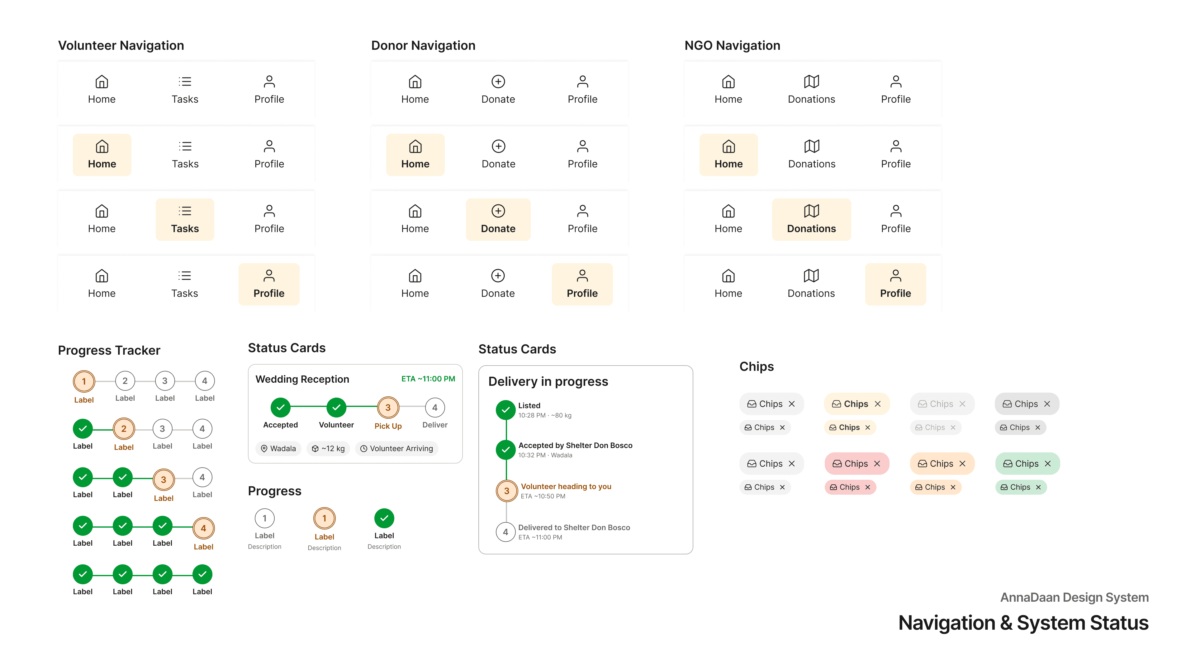
Navigation and System Status components guide users through the platform and provide timely feedback on actions and processes. They include role-based navigation, chips, progress indicators, and status trackers to support clarity, orientation, and real-time updates throughout the AnnaDaan experience.
Impact
The design system became the backbone of the entire project.
Consistent Experience
Shared components created familiarity across all user journeys.
Easier Theme Management
Light and dark modes remained synchronized through semantic tokens.
Faster Iteration
New screens could be assembled using existing building blocks instead of being created from scratch.
Scalable Foundation
The system provides a framework that can support future features and product growth.
Reflection
Key Learnings
Building AnnaDaan's design system changed how I approached product design.
Instead of focusing solely on individual screens, I learned how to create reusable patterns, scalable frameworks, and consistent experiences across complex user ecosystems.
More importantly, it taught me that good products are not built screen by screen—they are built through systems that allow those screens to work together seamlessly.