AnnaDaan
0 -> 1
Mobile App
Designing a Smoother Food Redistribution Experience

Project Overview
AnnaDaan is a three-sided mobile platform designed to reduce urban food waste in India by connecting food donors, NGOs, and volunteers in real time. The core insight driving the project: surplus food in Indian cities isn't a supply problem — it's a coordination problem. Food exists. Hunger exists. What's missing is the infrastructure to move one to the other reliably.
Timeline & Goal
2 months. The goal was to design a coherent end-to-end product experience for three distinct user roles — Donor, NGO, and Volunteer — that could function as a single unified platform without feeling like three separate apps stitched together.
My Role
Sole designer. I was responsible for the full design process: secondary research, defining the problem space, user personas, information architecture, flows for all three roles, UI design, and the design system. This was a self-initiated conceptual project for my Honours Capstone.
The Problem
India generates surplus cooked food every day from weddings and canteens — it spoils before it reaches shelters because donors, NGOs, and volunteers have no shared way to coordinate
The Solution
AnnaDaan is a coordination platform — not a donation form. It gives each user role the exact tool their job requires:


Donors
Donors can list surplus food in under 2 minutes and see exactly what happens to it after they do.
NGOs
NGOs get an urgency-sorted live feed of available food, with enough lead time to plan collection.
Volunteers
Volunteers get structured pickup tasks, a progress system that makes helping feel meaningful, and a reason to come back.
The three experiences are distinct in information hierarchy, and interaction model — but they share one underlying design system, one data layer, and one product logic.
Deep Dive - Process, Thinking & Decisions
Problem Background
The infrastructure for food redistribution doesn't exist yet.
In Mumbai specifically, the gap between food surplus and food insecurity is especially visible. NGOs operating in the city report that inconsistent supply — not lack of donors — is their primary planning challenge. Donations arrive unpredictably, in varying quantities, with no lead time.
Existing informal systems rely on personal contacts and phone calls. There is no standard process, no urgency signal, and no feedback loop to the donor. Food safety compliance is entirely dependent on individual judgment, with no embedded accountability.
The problem, at its root, is one of missing infrastructure: no shared visibility, no coordination layer, no incentive structure for sustained participation.
UX Research
Finding the gap no existing platform had filled.
Research combined three source types: India and Mumbai-specific food waste data — including Food Tank analysis of Indian social event waste, which estimates annual losses at USD 14 billion, and national figures showing 40% of food produced in India is discarded (10–20% of food served at a typical wedding going uneaten, amounting to 30–50kg per event) — an audit of six existing food redistribution platforms, and academic and NGO-published research on donor retention, volunteer behaviour, and sharing economy adoption in social good contexts.
Food waste statistics and reports
Existing food donation apps and platforms
Academic or NGO-published research on donor and volunteer behavior.

Competitive Audit
I audited six existing platforms — OLIO, Too Good To Go, Robin Hood Army, and Feeding India (Zomato) to understand where coordination currently breaks down and what interaction patterns had already been tried.
Platform
Key Observation
OLIO, UK
Peer-to-peer sharing, no urgency layer
Too Good To Go, Denmark
Commercial model, not charitable
Robin Hood Army, India
Proven model, WhatsApp-bound
Feeding India (Zomato), India
Operationally dependent, no self-service
None of the reviewed platforms offered event-scale surplus handling, real-time status visibility, structured volunteer dispatch, NGO supply reporting, and food safety verification in a single unified product — across any geography. That combined gap is what AnnaDaan is designed to fill.
How Might Wes
Framing the design space around the three core modes.
Donors
How might we close the feedback loop for donors — so they feel the impact of their donation, not just the act of listing it?
How might we make listing creation under 2 minutes — so a donor at a wedding can list food before they even leave the venue?
NGOs
How might we give NGOs advance visibility into incoming supply — so they can plan proactively rather than scramble reactively?
How might we give NGOs planning visibility through supply reports — so they can anticipate incoming food rather than just react to it?
Volunteers
How might we structure volunteer participation with tasks, progression, and rewards — so one-time help becomes a consistent habit?
System
How might we embed food safety into the listing flow — not as a gate, but as a natural part of the donation act?
Key Decisions

Decision 1
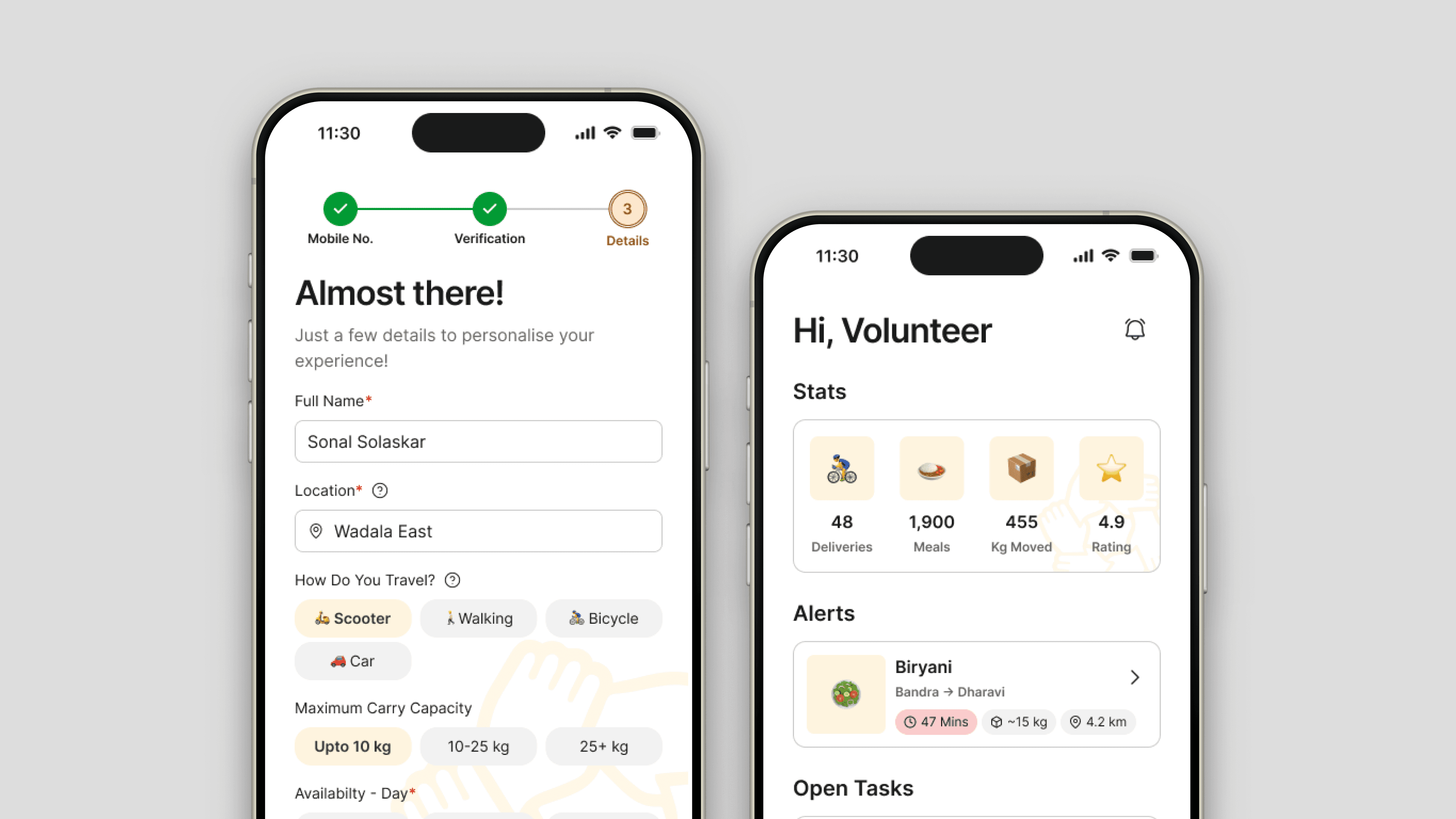
Volunteer discovery as a push, not a search
Volunteers set a preferred area once during onboarding. When a task opens nearby, a notification arrives and the task is displayed atop the screen as an alert. The volunteer responds to an opportunity rather than hunting for one. The decision to help is made in a moment of low friction, not at the end of an active search.
Tradeoff: volunteers with specific schedule constraints may receive notifications for tasks they can't take. Acceptable — declining a notification is a two-second interaction. Missing an opportunity because it was never surfaced means the food doesn't move.
Decision 2
Flexible commitment, not a locked schedule
The first question a potential volunteer has is whether this requires showing up on a fixed schedule. If the answer feels like yes — or even maybe — a significant portion of otherwise willing people opt out before trying. Obligation is the friction that kills casual participation.
The volunteer experience has no roster, no shifts, no required commitment. The home screen surfaces open tasks nearby; volunteers take what fits their day. Flexibility is the onramp. Progression handles retention once someone is in.
Tradeoff: flexible participation means NGOs can't predict volunteer availability. Addressed through the volunteer request flow — NGOs can flag that they need a volunteer for a specific pickup, which sends a targeted notification rather than relying on organic discovery.

Decision 3
NGO feed sorted by urgency, not recency
The default for any feed is newest first. For an NGO coordinator scanning available listings, newest first is the wrong sort — a listing posted an hour ago with 20 minutes left is more critical than one posted five minutes ago with three hours to go. Sorting by recency buries the listings most likely to expire unclaimed.
The feed sorts by time remaining. Color-coded pills reinforce the hierarchy at a glance: red under one hour, amber for one to three hours, green for three or more. The most time-critical listings are always at the top, regardless of when they were posted — so a coordinator scanning quickly acts on urgency, not novelty.
Tradeoff: a reliable regular donor who posts frequently can get buried under urgent listings from unknown sources. Accepted — the cost of missing a near-expired donation is higher than the cost of finding a familiar donor slightly lower in the feed.

Decision 4
NGOs claim listings — donors don't choose
NGOs see all live listings and accept based on their own capacity and proximity. The donor lists what they have and waits — the right organisation self-selects. Coordination moves to the side that actually has the information to coordinate.
Tradeoff: donors give up visibility into who takes their food. Resolved by the status tracker — donors see which NGO accepted and can view their profile, without ever having to choose.
Metrics
What success looks like for each role
Donor listing completion
Target: under 2 minutes from opening the listing flow to confirmation — chips, pre-filled location, and a 3-step structure are all working toward this
Volunteer return rate
Flexible commitment removes the obligation barrier. XP and leaderboard position are the proxies for whether people come back — progression signals replace the roster as the retention mechanism.
NGO response time on urgent listings
Target: first acceptance within the first hour of going live — urgency sort and countdown pills exist specifically to pull expiring listings to the top
Volunteer task acceptance rate
Target: high first-response rate on push notifications — a volunteer who receives a nearby task notification and doesn't need to go searching should convert at a higher rate than one who had to discover the task themselves.
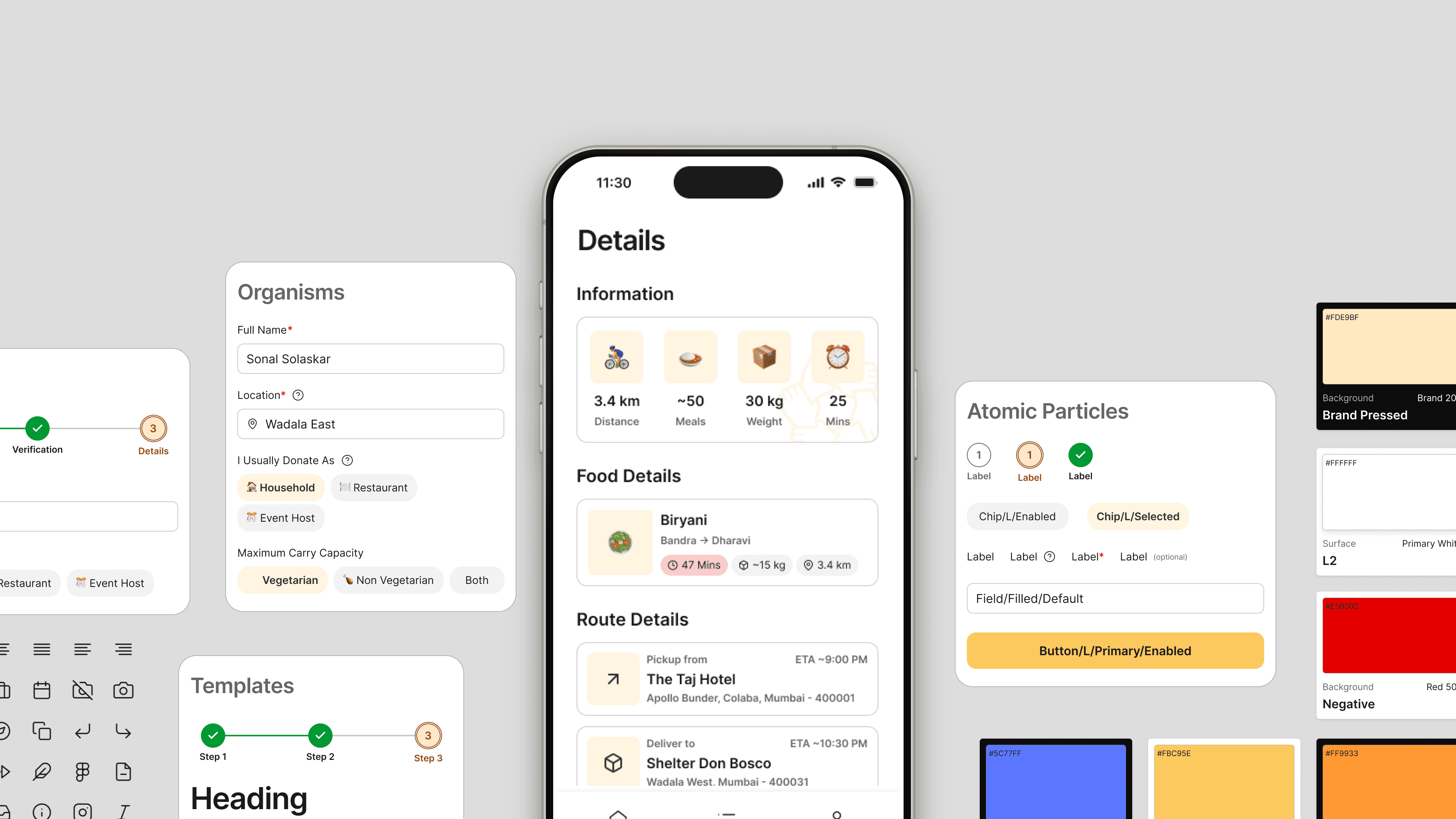
Design System
One System, Three Experiences — Built for Three. Consistent Across All of Them.
A foundational design system was built to maintain consistency across the different roles.

Final Design
Delivering a coordination experience that matches how each role actually thinks — not how a single-sided platform would assume they do.
Donor flow — surplus listed and tracked in under 2 minutes
A donor shouldn't have to think about logistics. The flow removes every decision that isn't theirs to make — NGO selection, coordination, routing — and gives them one job: describe what you have and where. The system handles everything after.
NGO flow — from urgency-sorted feed to receipt confirmation
An NGO coordinator's job is time-critical and high-volume. The flow is built around two completely separate cognitive modes — scanning for what to claim, and managing what's already committed — and keeps them on different screens.
Volunteer flow — from task notification to XP earned
The volunteer experience is built around one insight: people who'd help if it were easy won't go looking for the opportunity. Every screen in this flow is designed to reduce the distance between receiving a task and completing it.
Takeaways
What the interface taught me about designing systems under constraints.
Role-adaptive UI is harder than it looks. Designing one product that feels native to three completely different users meant every component had to earn its place across all three contexts — or be scoped deliberately to one. The role color system, the adaptive onboarding, the gamification boundary — all of it required total consistency to work. Any exception would have broken the logic. That kind of discipline is easier to commit to in a brief than to maintain across 37 screens.
What I'd do differently: Test the NGO feed sort with a real coordinator under time pressure — urgency-first is the right hypothesis, but the correct visual weight for the countdown pills and the right threshold for the color states is something only observed behaviour can settle. I'd also run the donor listing flow with someone mid-event, phone in hand, genuinely distracted. That's the condition it was designed for, and a controlled prototype session doesn't replicate it.