Class Craft
Website
Redesign
Streamlining a Complex Student Registration Workflow

Project Overview
As a personal UX project, I took on the challenge of redesigning my college's course registration platform. The existing interface made a simple task unnecessarily frustrating for students. Through user-centred research and iterative design, I aimed to create a seamless scheduling experience that gives students true control over their academic journey.
Timeline & Goal
4 months to redesign the wedsite.
My Role
Solo UX Designer. I led the entire design process from research, synthesis, wireframing, and prototyping while keeping the students at the centre of every decision.
The Problem
My college's course registration platform - 'My TimeTable' left students enrolling in duplicate slots, manually resolving time conflicts on paper, and navigating a broken flow and turning a five-minute task into a source of genuine stress.


The Solution
Show students only what they need.
Block what can go wrong.
ClassCraft strips the process to its essential job: help students build a valid, conflict-free schedule before the window closes with confidence, not anxiety.


Department-scoped onboarding
Students confirm their department and year first, collapsing the course list to only relevant slots
Auto-disable on enrollment
Once a slot is picked, all other slots for that course and overlapping time blocks are instantly disabled
Real-time availability indicators
Color-coded fill levels surface urgency without requiring students to re-navigate
Live visual timetable
A calendar view updates in real time as slots are selected, preventing invisible conflicts
Deep Dive - Process, Thinking & Decisions
UX Research
I used surveys, interviews, and usability tests to find out what was really breaking
I had used the platform myself, which gave me hypotheses but also blind spots. To separate personal frustration from systemic failure, I ran structured research across five departments before touching any wireframe.
Survey — 20 participants A structured questionnaire targeting SE, TE, and BE students across IT, COMP, EXTC and BIOM. Questions focused on task completion confidence, most-used flows, and emotional response during enrollment windows.
Semi-structured Interviews — 4 participants One-on-one sessions lasting 20–35 minutes. I asked students to walk me through their last enrollment experience from memory, probing for specific moments of confusion, workarounds, and emotional state.

Key Findings
The research surfaced three categories of failure not just UI problems, but structural ones the interface couldn't paper over:
Navigation broke mental models
Students expected to move linearly through courses. Instead, every enrollment kicked them back to the homepage, forcing them to restart orientation. 7 of 8 interview participants described this as their primary frustration.
Information overload at the wrong moment
All departments and years were shown simultaneously with no filtering. Students were scanning through all slots to find their own. 88% of survey respondents said locating the right slot took longer than expected.
No system-level guardrails
The platform allowed duplicate and time-conflicting enrollments. Students had developed paper-based workarounds — cross-referencing timetables manually — because the system offered no real-time feedback. Only 12% reported feeling confident they had enrolled correctly.
It was difficult to effectively find the slot you were interested in, it was time consuming to map course code with course and while we do this the slot was full.
SE INFT Student
The way courses are labelled on the website is confusing, leading students to select the wrong slots.
SE COMP Student
Where users were dropping

How I redesigned the flow

Problems Identified
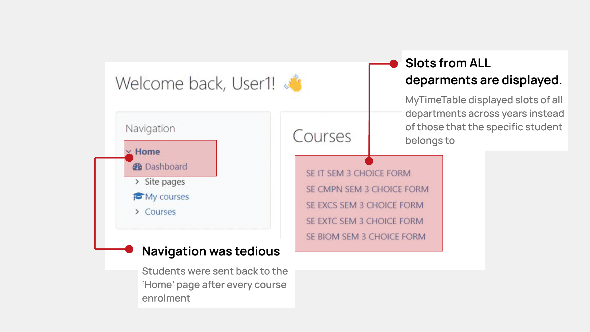
Problem 1
Unfiltered course list shows all departments
The platform displayed choice forms for every department and year simultaneously, requiring students to manually identify which courses were relevant to them.
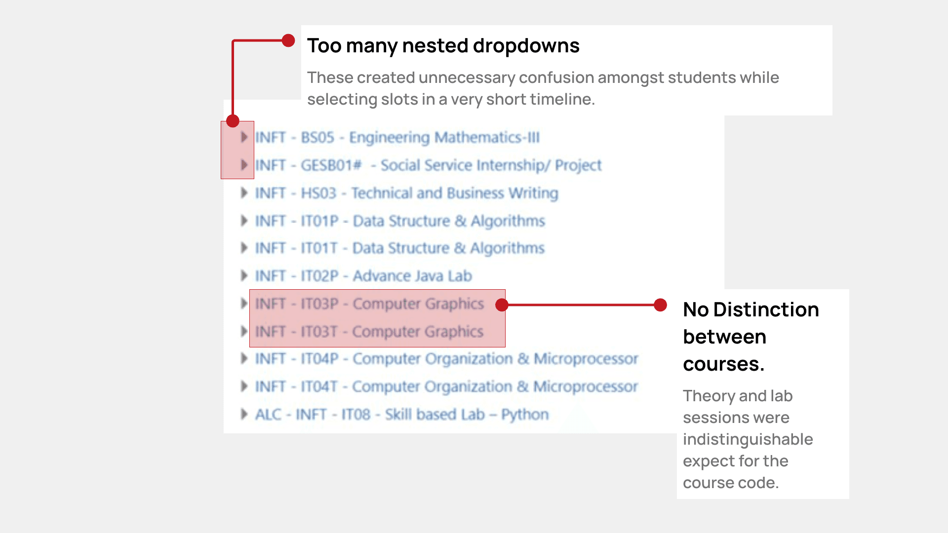
Problem 2
Excessive nesting creates cognitive overload
Multiple layers of collapsed dropdowns forced students to expand and scan through content repeatedly, adding unnecessary friction during an already stressful process.

Problem 3
No information hierarchy & visibility into slot availability
All slot details were presented in a single dense line of text, forcing students to read each entry in full just to find the information they needed. There was no indication of whether a slot was full or filling up, leaving students with no way to prioritise or plan before a slot disappeared.

Problem 4
Forced repetition between enrolments
Students were required to navigate back to the home page after every single enrolment, breaking their flow and adding unnecessary steps in a time-limited process. The search feature offered no clear way to return to the course list, leaving students more disoriented than before they used it.

Problem 5
Unnecessary added steps
Clicking on a full slot still showed an enrolment button, giving students false hope before revealing it was unavailable, wasting critical time during the scheduling window.
Requirements & Goals
HMW help students build a conflict-free schedule before the window closes?
Filtered, relevant course list
Show each student only the courses and slots that belong to their department and year.
Conflict-free enrollment by default
Prevent duplicate and time-conflicting slot selections at the system level, so students never have to track this themselves.
Real-time availability signals
Surface how full each slot is as it fills, so students know where to act first before it's too late.
Uninterrupted enrollment flow
Let students move through all their courses in a single session, without being sent back to the home page each time.

Design Decisions
Every choice had a tradeoff. Here's how I reasoned through them.

Decision 1
Showing all departments at once causes cognitive overload
Add a department + year confirmation step during onboarding, pre-filtering the course list before students see it.
Tradeoff: adds a step to the flow. Accepted because reducing irrelevant choices saves far more time downstream. Ideally, if the college shares student credentials, this step is auto-populated.

Decision 2
Students can enroll in duplicate slots and block peers
On enrollment, auto-disable all other slots for that course AND all time-conflicting slots across the board.
Tradeoff: removes flexibility. But the data showed "flexibility" was being abused, not used. This is a guardrail, not a restriction — it enforces a rule students couldn't enforce themselves.

Decision 3
Students don't know which slots are close to full
Color-coded availability indicators with live seat count. "Filling fast" label appears under 20% capacity.
Tradeoff: color alone isn't accessible — added text labels alongside color. Borrowing from ticketing UX (concerts, flights) where this mental model already exists for users.

Decision 4
Navigation loop forces dashboard return between each course
A persistent right-panel shows enrolled selections throughout the entire session. Back button returns to the slot list, not the dashboard.
The original flow was designed around the LMS structure, not the user's mental model. The fix was conceptually simple but required rethinking the page architecture entirely.

Decision 5
Students build paper timetables because the system shows no schedule view
Live calendar panel updates in real time as slots are selected. Users see their week take shape as they enroll.
This was the highest-effort, highest-impact feature. It turns a form-filling task into a spatial, visual experience — which is how students already think about their schedules.
Metrics
What success looks like for students
Duplicate slot enrollments per session
0 — enforced by system constraint
Conflict detection (time clashes)
100% — auto-disabled at selection
Time to complete full schedule
↓ 40% reduction in time-on-task (estimated)
Student-rated ease of slot discovery
Target: <2 of 11 rating difficult post-launch
Final Design
Delivering a scheduling experience that matches the mental model students already have — not the one the system assumed
Onboarding flow - Filtered, relevant course list
Students confirm their department and year on first login, collapsing the course list to only their relevant slots before they see anything else.
Slot selection flow - Conflict-free enrollment, real-time availability
A single, searchable course page replaces the nested dropdown structure. Color-coded availability indicators surface urgency inline, and selecting a slot instantly disables duplicates and time conflicts across the board.
Schedule confirmation flow - Uninterrupted enrollment, live calendar view
A persistent side panel keeps all enrolled selections visible throughout the session. A live calendar updates in real time as slots are added, so students can review their full week before confirming — without ever leaving the page.
Takeaways
Designing systems, not screens.
The deeper I went into research, the more I realised the interface wasn't just poorly designed — it was built around the wrong model entirely. It assumed students would adapt to the system. The system never tried to adapt to them.
I also learned that removing something can be a design decision. The auto-disable feature, the filtered course list, the persistent side panel — none of these added functionality in the traditional sense. They took things away: irrelevant choices, repeated navigation, the mental overhead of conflict-checking. Sometimes the most useful thing a designer can do is decide what a user shouldn't have to think about.
And perhaps most personally — I was the user. That gave me hypotheses quickly, but it also gave me blind spots. Learning to let the data lead, even when it contradicted my own experience, was its own quiet discipline.