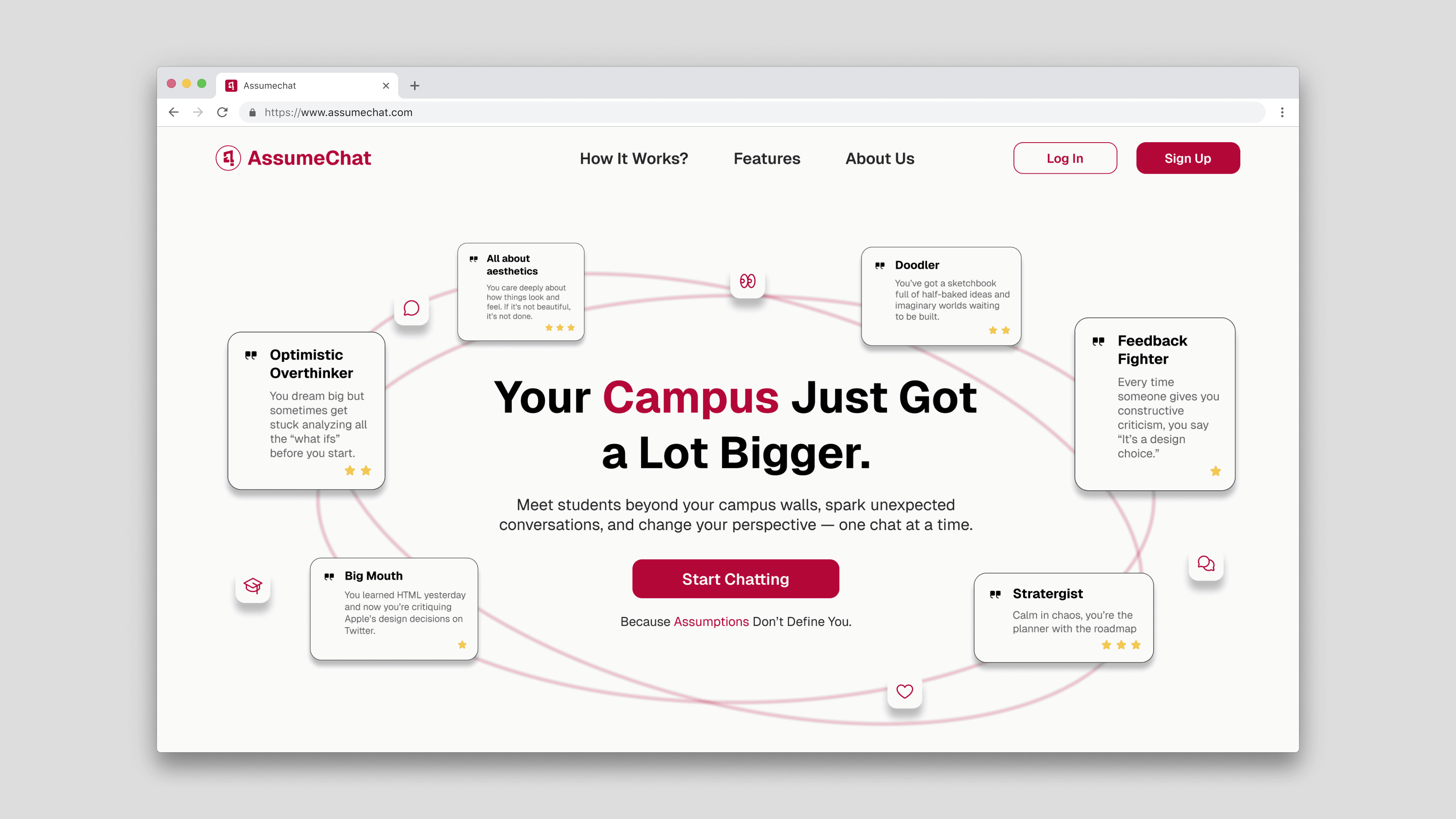
Assume Chat
Brand Identity
Building Assume Chat's Brand Identity

Project Overview
Complete brand identity for a campus-only chat platform — from logo concept to visual system — built to feel youthful, bold, and unmistakably digital-native.
Tools
Figma
Scope
Logo · Color · Type · Mockups
Timeline
3 Hours
Brand Brief
What is AssumeChat?
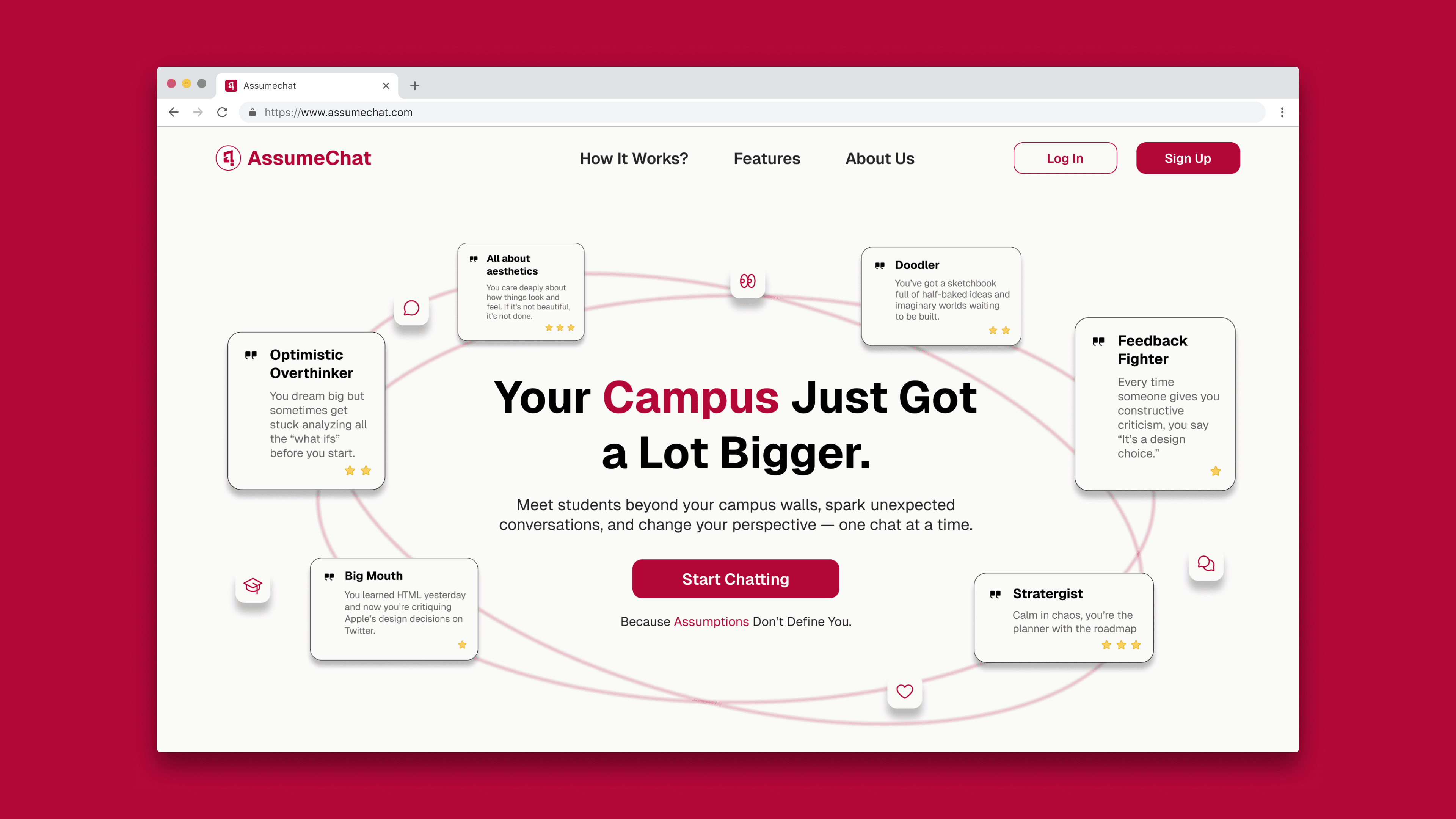
AssumeChat is a campus-only chat platform that connects students from different colleges through spontaneous, real-time conversations. The brand needed to stand apart from dating apps and curated social media. No swipe culture, no vanity metrics. Just real talk between verified students, driven by curiosity.
Authenticity
Real students, real talk — no filters, no bots
Safety
Secure environment built on verified student access
Spontaneity
Conversations sparked by curiosity, not curation
Playfulness
Fun, unpredictable — where assumptions fuel discovery
Logo Concept
From sketch to symbol
The brief called for a mark that was simultaneously a wordplay on the brand name, a chat metaphor, and a signal of curiosity — layered meaning inside a single, minimal icon.
Mind mapping
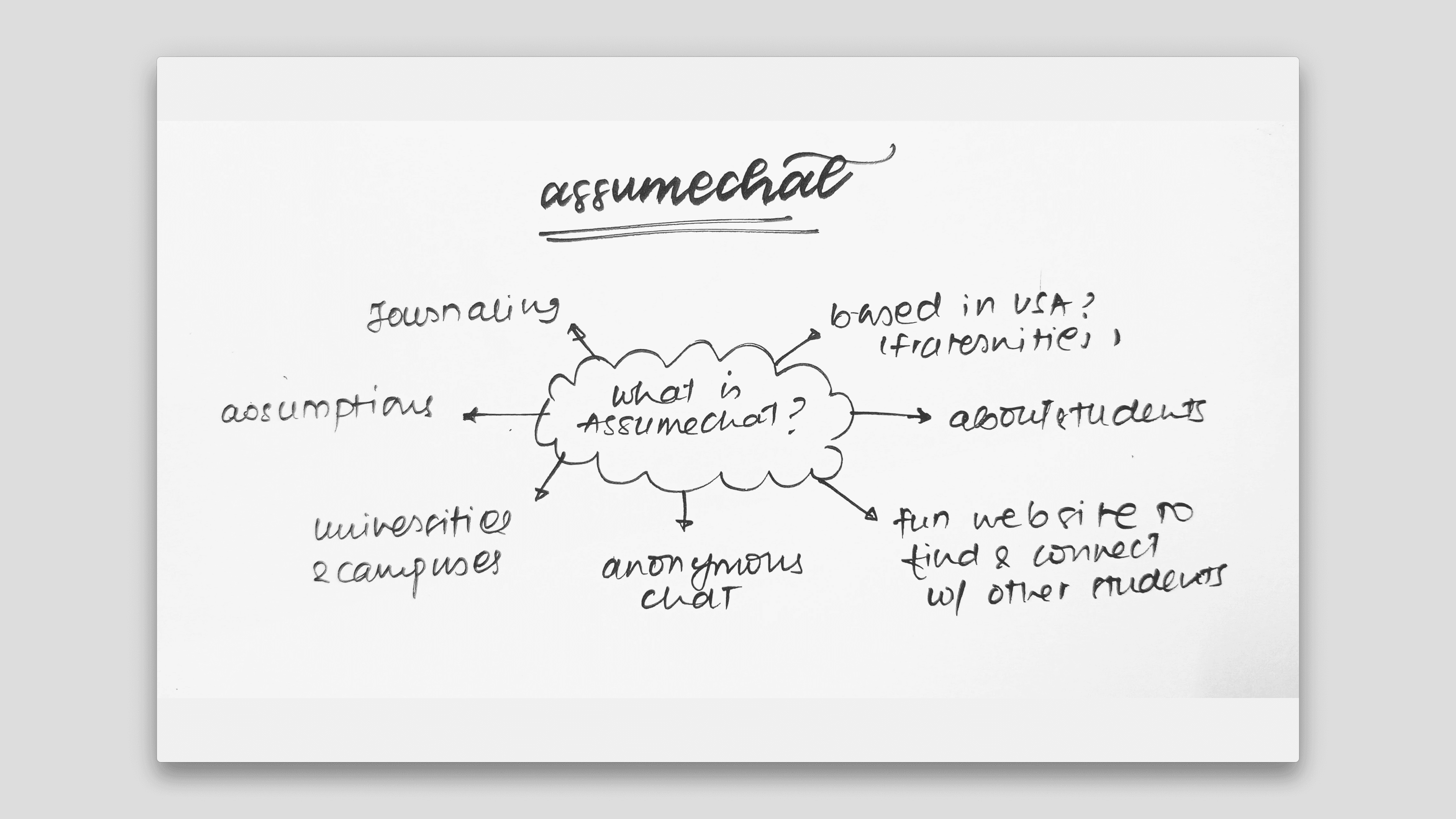
Explored brand attributes: chat, curiosity, assumptions, campus, connection, spontaneity. Identified 'a', 'c', quotation mark, and question mark as core visual anchors.
Sketch exploration
Sketched multiple directions — abstract letterforms, chat bubble hybrids, shield concepts. Tested readability at small sizes for app icon use.

Visual Identity
Color & typography
The visual direction embraces modern minimalism infused with layered symbolism — bold yet clean, using geometric abstraction to speak to Gen Z sensibilities while staying recognizable at any size.

Crimson
Invokes urgency, curiosity, and emotional depth — perfectly aligned with AssumeChat's mission of sparking spontaneous, meaningful conversations.
Bright Gray
Provides a clean, minimal counterbalance. Its neutrality keeps content readable and reinforces the minimalist style while letting the crimson carry emotional weight.

Geist Bold
Adds visual impact without sacrificing simplicity. Confident and expressive — making key messages stand out while staying true to the brand's bold tone.
Geist Regular
Its neutral, geometric form ensures content is clear on screen. It doesn't compete with the symbolic logo — letting the mark shine.
Final refinement
Built the visual identity that feels fresh and youthful.


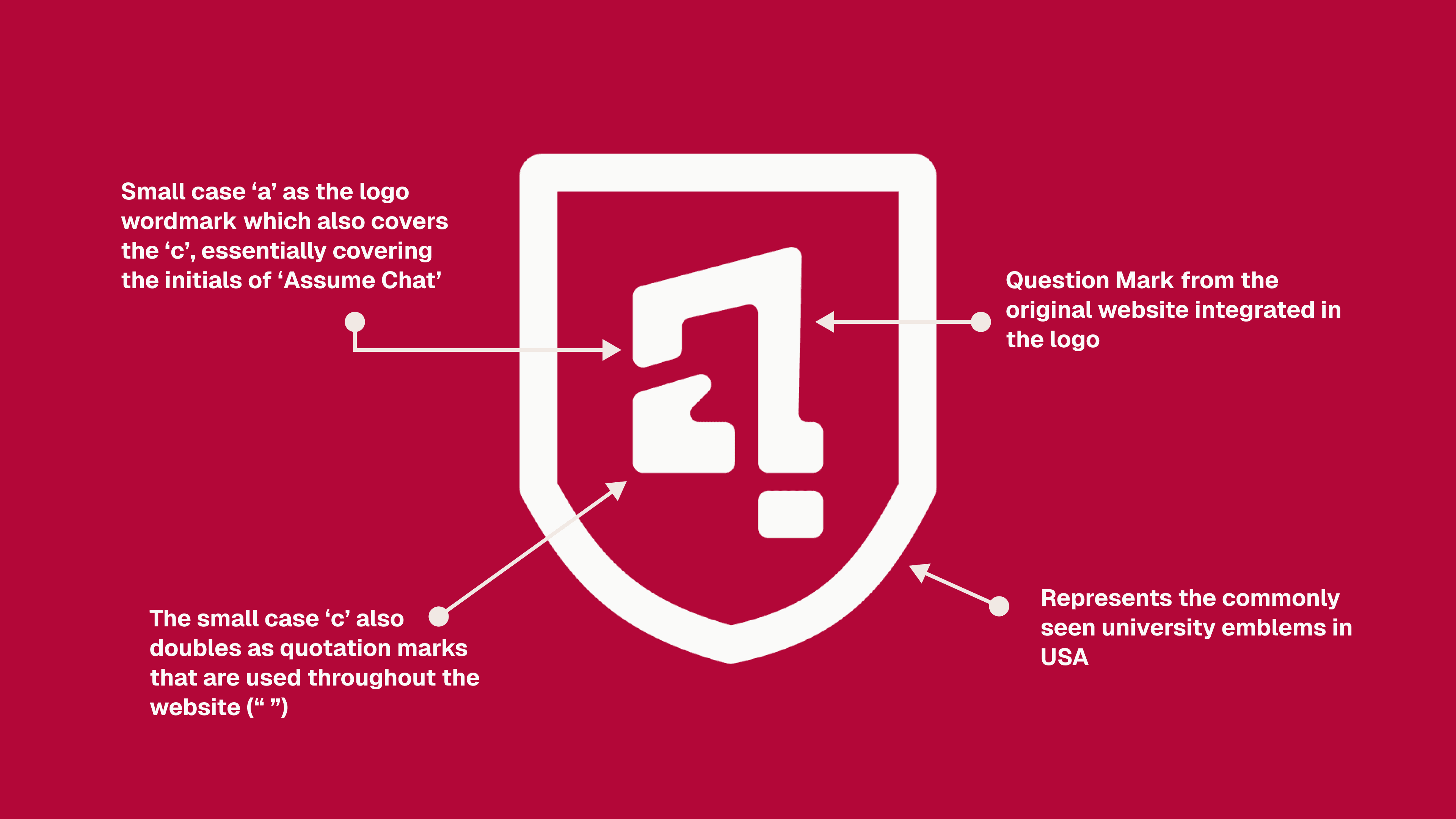
Initials a + c
Integrated into a unified abstract form — the platform's name made visual
Quotation mark
Subtly built into the shape — reinforces the chat-based experience
Question mark
Embedded within the form — captures curiosity and the spirit of assumptions
Shield emblem
Nods to US college crests — conveys trust and .edu-only access
Mockups
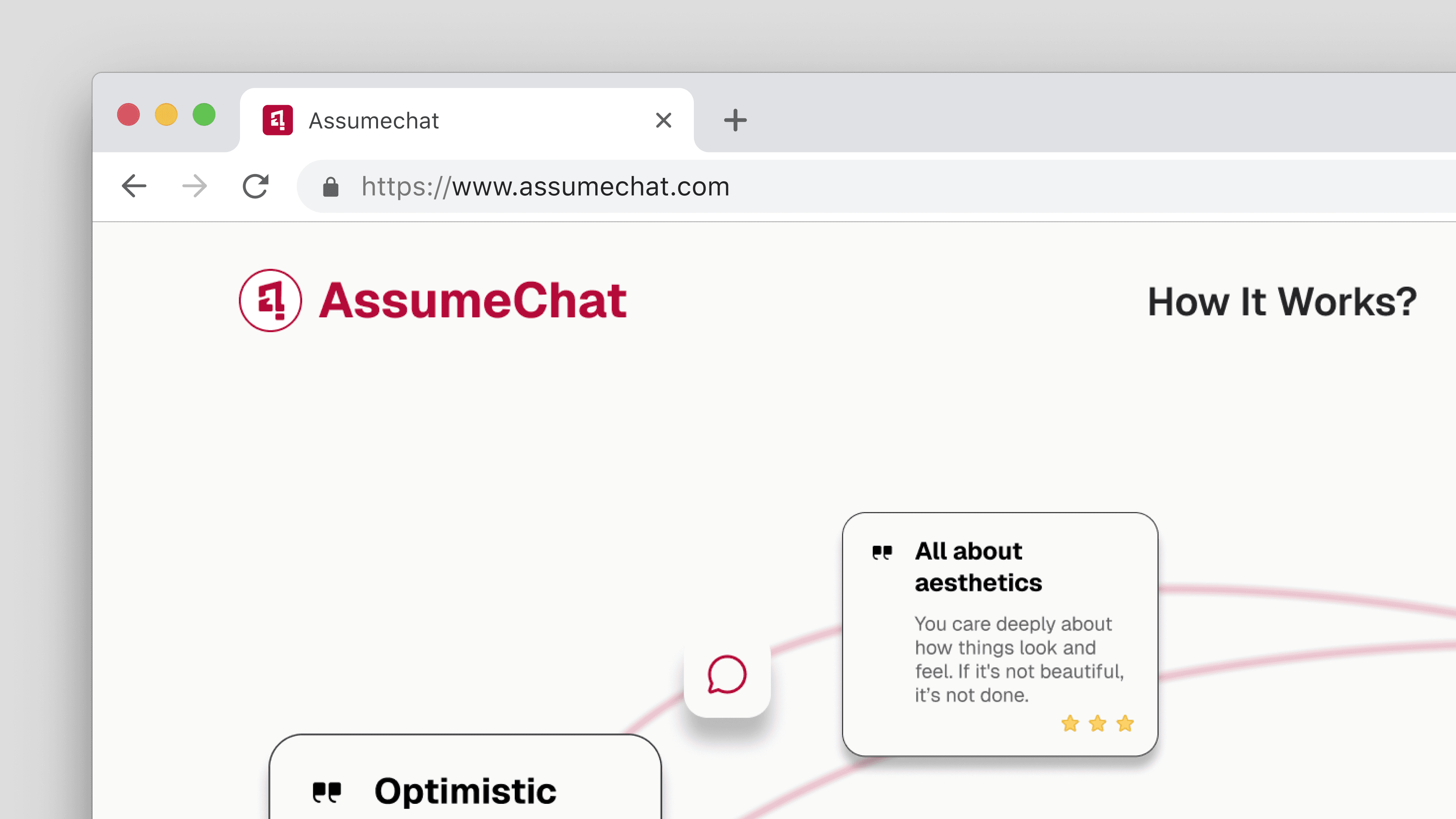
Identity in the wild



Takeaways
Closing the loop
The 'ac' mark, with its hidden quotation and question marks, packs three brand truths into one shape: it's a conversation, it's curious, and it's unmistakably theirs. Paired with crimson's confidence and a typeface that never competes with the symbol, the identity scales from a tiny app icon to a campus tee without losing its voice.